Unless you are under age 20 or so, you are likely to have seen myriad rebuttals of arguments like the one made by Rep. Dean Phillips (D-Minn.) last week.
Phillips, who is making a functionally hopeless bid for the Democratic presidential nomination, offered a map of the 2020 presidential results by county.
The Democrats condemning my friendly visits with Trump supporters outside his rally are the same people coronating Joe Biden and questioning why America is so red.
That’s why we need a candidate who leads with invitation, not condemnation, of fellow Americans. pic.twitter.com/GldmTZ6hPt
— Dean Phillips (@deanbphillips) January 24, 2024
Phillips was responding to criticism of his having talked to supporters of Donald Trump whom he encountered at a rally — a group that the Democrat declared to be “nice.” The criticism was often about the silliness and superficiality of his apparent discovery, but he suggested that it came from “the same people coronating Joe Biden and questioning why America is so red.”
Then the map, with lots of large, red counties that makes the country look “so red.” It was, ironically, a silly and superficial response.
But he wasn’t alone. Over the weekend, Trump shared a social media post from his former adviser Stephen K. Bannon, offering a similar map. Bannon wrote that it showed “America IS Trump Country” — though of course, Trump received 7 million fewer votes in 2020 than did President Biden.
Again, you’ve probably seen these maps before and read various debunkings of them. I mean, I’ve written probably a half-dozen, in keeping with my general exasperation about bad data visualizations. The upshot is that, thanks to his strength with rural voters, Trump won a lot of places that are spacious and lightly populated, while Biden won lots of places that are compact and densely populated. So the small blue areas on Phillips’s and Bannon’s maps just have a ton more voters.
But let’s flip this around. Instead of scaling the map to better capture that proportionality, let’s instead show the disadvantages Democrats face in land-area representation.
Nationally, there are about 6.8 acres of land for every U.S. resident. (An acre is about three-quarters of a football field. So, from one end zone to the other team’s 25-yard line or so.) Let’s give our anthropomorphic USA here a circle to represent that average.
At the state level, though, this varies. Consider D.C. and Texas. D.C. residents only have about 0.1 acres apiece; Texans get 5.7 acres.
Texas is a big state and a populous one, so its acres-per-resident is lower than the United States overall. That’s because of states like Alaska, where each resident gets to represent about 500 acres — an area the size of Monaco, in case that’s a useful reference for you.
(Notice that the size of the circles changes between illustrations, but the scales relative to the other circles in an illustration remain accurate.)
That’s looking at state residents, though. If we look at the number of 2020 voters, the ratios get more dramatic. Each 2020 Alaska voter is allocated more than 1,000 acres, one-39th of D.C. itself.
The Phillips and Trump maps, though, looked at the county level, where the relationships vary even more widely. The county where 2020 voters each represented the least acreage was New York County, N.Y., more commonly known as Manhattan. Each Manhattan voter represented 0.02 acres in 2020, the size of about six parking spaces. On average, American voters in 2020 represented about 678 times as much acreage as Manhattanites.
The county that had the most acreage per voter in 2020 was Loving County, Tex., a massive, sparsely populated county on the border of Texas and New Mexico. There, the double-digit vote total left each voter with just under 6,500 acres apiece.
(Manhattan’s acreage is shown below, by the way: It’s about the size of an M&M at the happy fellow’s feet.)
Loving County and its less than 100 voters is visible on Phillips’s and Bannon’s maps. Manhattan is not. By the way, if you are looking for a sense of scale for Loving’s 6,500 acres, that area is about one-third the size of Manhattan. So four voters from Loving County represented as much acreage as the 700,000 voters in New York County.
If we flipped this ratio around, giving just the voters who cast ballots for Biden in Manhattan the same acreage as Loving County residents got, the resulting area would cover every inch of U.S. land and 60 percent of Canada, too.
America IS entirely Biden Country, and so is more than half of our northern neighbor, Stephen K. Bannon might write.
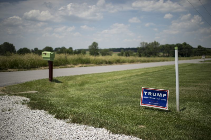
This is all intentionally silly, as noted at the outset. It is fair to note that tens of millions of people voted for Trump and that nearly half of voters in current polling continue to offer him support. But he is not dominant in either polls or the 2020 results. What’s dominant in those maps is dirt and pavement that are in the vicinity of Trump voters.


